
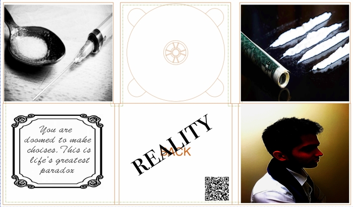
Here is our final version of Digipack
P.S. for this task I have used brilliant program “AFFINITI Photo”

Here is our final version of Digipack
P.S. for this task I have used brilliant program “AFFINITI Photo”
I chose the Groove Armada’s digipak for this task.

(This is the font of original Groove Armada’s Digipak)

(This is the rear side of her Digipack)


(And those two pictures are inside of this digipack)
I have done the Prazi about it, here is a link to my presentation:

http://prezi.com/hupmv5zngglz/?utm_campaign=share&utm_medium=copy&rc=ex0share


Here are some good examples of a famous albums in Hip-Hop industry: Notorious B.I.G – Ready To Die, Kanye West – My Beautiful Dark Twisted Fantasy and Tyga – The Gold Album. They are represented in quit simple and minimalistic way. I think, this style the best for albums covers and not just in Hip-Hop industry.
So, here is also the list of rules for our Digipack:

There are a number of differences between the Digipaks and CD cases:
A digipak refers to a certain kind of CD case, the one that I will be designing. It essentially consists of a plastic disc tray that has been glued inside a folded cardboard case. Digipak once referred specifically to the patented digipak packaging but has now become a genericized trademark that is basically used for any cardboard centred CD packaging.
They are made of paper, and despite this they were once considered the environmentally friendly version of CD cases, however they have remained less common due to the fact that they can survive less wear and tear than jewel cases, particularly when they are in the store, ojn top of this they have higher manufacturing costs.
Here is a list of things, which we will include in our promotional package:
One thing that the majority of album arts and visual promotions from artist across the spectrum of genres have in common, is that they all have a few letters/words printed. To research different styles of fonts and get them I visited “dafont.com”
To research different styles of fonts and get them I visited “dafont.com”

There I found a lot of interesting styles of fonts, but for our track we need quite “formal” one. So, I chose a few styles, which I think might be the best for us.
Also, I researched some fonts in basic program for Apple – “Pages”

Here are some examples of fonts, which I like:

Analysis of Existing Digipaks In order to develop a subtle understanding of the technical features and conventions of digipaks, I have studied examples from a range of artists in Hip Hop style.
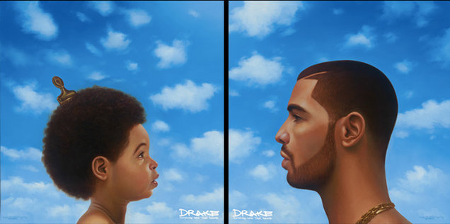
On August 21, 2013, Drake revealed the album’s cover artwork was an oil painting by Southern California’s Kadir Nelson, the designer behind Michael Jackson’s posthumous album, Michael. The two versions of the cover feature illustrations of profiles of Drake as a child, while the other shows the rapper as an adult. His younger self is adorned only with an afro comb in his hair, and his older self has a gold chain. Both covers are set against a blissful blue sky. The cover artwork was compared to iconic hip hop albums Nas’ Illmatic, The Notorious B.I.G.’s Ready to Die and Lil Wayne’s Tha Carter III. “What that album art is to me, is the fact that this is my most clear, concise thoughts from now, and my best recollection of then”, Drake explained. Both covers will be available side by side in stores, so consumers may choose which one they want.

I have analysed, J. Cole’s album. The main image on the front of the album contains the artist. He is sitting on the edge of a rood, wearing casual urban clothing ( which is conventional for most hip hop artists). The scenery behind him seems to be a blurred forest in front of the sky, creating synergy between the title and the image. The cover image also uses a low angle shot, which makes the artist appear to be more powerful / significant that their audience, which is a reference here to his musical auteur of being omniscient. The cover also features a parental advisor logo to inform the consumer that this product contains explicit content. The optical disc cover also creates synergy wth the rest of the album by using the same theme linked to the title. The bricks show on it are to represent the house show on the cover of the album. The title on the cover uses a minimalistic bold font in white (representing the purity of the artist and their ideologies). The font does not draw too much attention away from the main image however, it is slightly hard to read.
Here we go!


